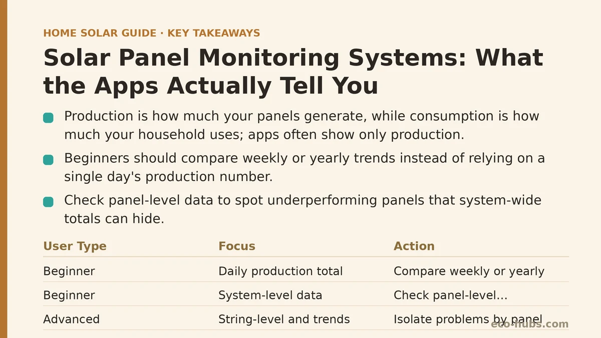
Production and consumption are not the same number, though most homeowners glance at their solar app and assume the big kWh figure on the home screen covers both. Production tells you how much energy your panels generated. Consumption tells you how much energy your household used. A monitoring app that shows a healthy production number can still be paired with a bill that went up, and the confusion between these two figures is where most misreadings of a solar dashboard begin.
Two Different Users, Two Different Dashboards
The same app looks entirely different depending on who is reading it. A beginner homeowner typically wants one answer: is the system working? An advanced homeowner — someone comfortable with electrical systems or already tracking their own energy use — tends to dig into string-level data, degradation curves, and export ratios to catch problems before they become obvious. The interface doesn’t change between these two users, but what each of them notices, and what they miss, changes quite a bit.
Beginner Homeowner: Reading the Home Screen
For most new solar owners, the home screen’s single daily production number becomes the de facto health check. It’s an easy habit to form and not an unreasonable one, but a single day’s number is noisy on its own. Cloud cover, a shaded tree branch that grew a few inches, or a temporary inverter hiccup can all pull that number down without indicating a real problem. Judging system health from one day’s total is a bit like judging your health from a single blood pressure reading taken right after climbing stairs.
Advanced Homeowner: Reading the Home Screen
Someone with more technical comfort tends to skip past the daily total and go straight to the trend view, comparing the current week against the same week last year or against the production estimate provided at installation. This comparison, discussed further in our payback period guide, is a far more reliable signal than any single day, because seasonal and weather variation is baked into a year-over-year comparison in a way it simply isn’t in a 24-hour snapshot.
Beginner Homeowner: Panel-Level vs. System-Level Data
Many monitoring apps offer a system-wide total by default, with individual panel data tucked a few taps deeper into the interface. Beginners often don’t realize this second layer exists, which means a single underperforming panel — one with a loose connection or partial shading — can quietly drag down overall output for months while the system-wide number still looks broadly acceptable.
Advanced Homeowner: Panel-Level vs. System-Level Data
Advanced users generally check the panel-level breakdown routinely, since it’s the fastest way to isolate a problem to a specific location on the roof rather than troubleshooting the whole array. If eleven panels are producing at expected levels and one is producing at sixty percent, that single outlier is far easier to diagnose — and far cheaper to fix — than waiting for the aggregate number to drop enough to notice on its own.
Beginner Homeowner: Alerts and Notifications
Most apps send push notifications when something looks off, and beginners tend to treat every alert as urgent. In practice, a large share of these notifications are low-priority: brief communication dropouts, momentary inverter resets, or weather-related dips that resolve on their own within a day. Treating every alert as an emergency call to the installer leads to unnecessary service fees and, over time, a habit of tuning out alerts altogether — including the ones that matter.
Advanced Homeowner: Alerts and Notifications
Experienced users generally learn to distinguish alert categories fairly quickly: communication errors versus production errors versus hardware fault codes. A communication dropout that resolves itself overnight is noise. A recurring fault code tied to the same inverter component across multiple days is signal, and worth a call. This filtering ability is less about technical sophistication and more about simply watching the pattern of alerts over a few months before deciding which ones warrant action.
Beginner Homeowner: Understanding kW vs. kWh
It’s a small distinction with a large effect on how the dashboard reads. kW is a rate — how much power the system is producing at this exact moment. kWh is a total — how much energy has accumulated over a period of time. Beginners frequently glance at a kW figure during a cloudy afternoon, see a low number, and assume something is wrong, without recognizing that a low instantaneous rate on an overcast day is completely normal and says nothing about the day’s cumulative kWh total.
Advanced Homeowner: Understanding kW vs. kWh
Advanced users tend to watch the kW curve shape across a full day rather than any single reading — a smooth bell curve peaking around solar noon is the expected pattern, and a curve with unexplained flat spots or sudden drops is what actually warrants investigation. The kWh total at day’s end confirms whether that curve translated into the expected energy output, but the shape of the curve itself is often the earlier warning sign.
Beginner Homeowner: Comparing Actual vs. Estimated Production
The production estimate provided at the time of sale sets an expectation, and beginners often compare their app’s numbers against that estimate on a day-by-day basis — which is a mismatch, since the original estimate was built as an annual or monthly average, not a daily guarantee. A single low day against that estimate doesn’t mean the estimate was wrong.
Advanced Homeowner: Comparing Actual vs. Estimated Production
Advanced homeowners generally hold off on judging the estimate until they have a full year of data, then compare month-by-month totals against the original projection, accounting for known factors like an unusually cloudy season. This longer comparison window is the only fair way to evaluate whether an installer’s original production estimate holds up, and it’s worth revisiting our guide on production estimates for how those original numbers get calculated in the first place.
Beginner Homeowner: Self-Consumption and Grid Export Figures
Apps that show how much solar energy was consumed directly by the household versus how much was exported to the grid can be genuinely useful, but beginners sometimes misread a high export number as pure waste. Depending on your utility’s net metering structure, exported energy is often credited back at a meaningful rate rather than lost value, so a high export figure isn’t automatically a problem to solve.
Advanced Homeowner: Self-Consumption and Grid Export Figures
Advanced users tend to use this same data to time discretionary loads — running an EV charger or water heater during peak production hours to raise self-consumption and reduce reliance on evening grid draw, particularly under time-of-use rate structures where evening electricity costs more than midday electricity. The export/self-consumption split becomes a planning tool rather than just a reporting figure.
Beginner Homeowner: Long-Term Degradation Tracking
Panels lose a small amount of output capacity every year — typically around half a percent — and this is normal, expected, and already factored into manufacturer warranties. Beginners occasionally see a slightly lower year-over-year number and assume the app is reporting a malfunction, when it’s more likely just ordinary degradation playing out exactly as the panel’s warranty documentation predicted.
Advanced Homeowner: Long-Term Degradation Tracking
Advanced users tend to plot year-over-year output against the manufacturer’s stated degradation curve to confirm the system is aging within expected parameters. A drop that tracks closely with the warranted curve confirms nothing is wrong. A drop that significantly outpaces it is the kind of finding worth raising with the installer or manufacturer while the equipment is still under warranty coverage.
Where the Two Approaches Really Diverge
Beginners and advanced users are looking at the same raw data, but the beginner tends to react to individual data points while the advanced user reacts to patterns across time. That difference in approach, more than any technical skill gap, explains why one homeowner calls their installer over a normal cloudy-day dip while another lets the same dip pass without concern. Building the habit of checking trends instead of single snapshots is something any homeowner can adopt, regardless of technical background.
A Few Habits Worth Building Regardless of Experience Level
Checking the app weekly rather than daily reduces a lot of unnecessary worry, since weekly totals smooth out the noise that daily numbers carry. Comparing current output against the same period last year, once you have that data available, is more informative than comparing against the original sales estimate. And treating persistent fault codes differently from one-off communication errors will save both money and stress over the life of the system.
Which part of your monitoring app feels the least clear right now — the daily production number, the alerts, or how your numbers compare to what was originally estimated? Let us know where the confusion sits and we can walk through what your specific readings likely mean.
Related guides: Solar Panel Cleaning: How Often Does It Actually Matter, Solar Panel Shading Issues and Solutions: A Troubleshooting Guide, and Solar Panel Efficiency Degradation Over Time: What Actually Slows Down.
🔗 Recommended Reading
- Solar Panel Monitoring Apps: A Setup Guide for Beginners
- How to Read Your Electricity Bill After Solar: A Line-by-Line Walkthrough
- Solar Incentive Paperwork: Common Filing Mistakes That Delay Your Rebate
- Home Battery Sizing Mistakes That Lead to Blackout Regret
- Common Solar Installer Mistakes Homeowners Should Catch Before Signing